Short and sweet this month as I was away in Europe for work.
- [Aviation] Boeing Widebody Identification
- [Aviation] How to operate an airport in Antartica. ‘Nough said.
- [Aviation and Design] Air France’s Design
- [Aviation and Design] Airline Logo Design
- [Climate] How to make your product design job a climate job
- [Climate] Applying the principles of permaculture for a more sustainable design ethos. This was a bit of an academic read.
- [Climate] I think about this often in relation to the program of work I run. There are some great actionable insights in here but also “when the sky falls” (literally and figuratively) things in here. https://drive.google.com/file/d/1zVpLDiHen_-Py2SJSeM6E-cDvTT1UeGZ/view
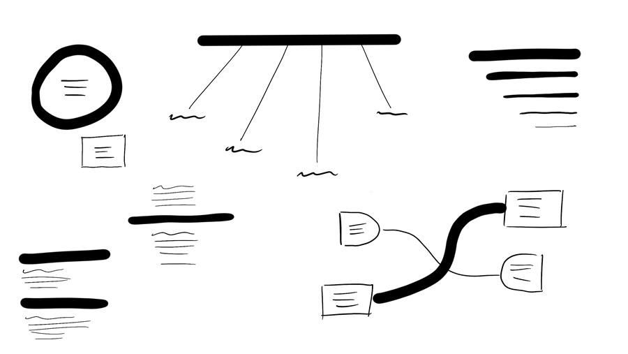
- [Design] I ADORE this series by the Sketch Group about Mastering the Line. Such an easy thing to get started in sketchnoting.
*Visual Thinking series, Part 4:*Mastering the Line—Thick and Thin
In a previous issue we talked about how to use a chisel tip marker to create different line thicknesses. Let's expand on that and explore when we might use a thick or a thin line.
The line is such a foundational tool—it might seem simple, yet has immense power in creating emphasis, structure, and variety. Lines can direct the viewer’s eye, add personality, and establish a hierarchy. Practice drawing thick and thin lines to get a feel for how they impact a page. Start by experimenting with different markers or pens if you have them: a thick, chisel-tip marker versus a finer pen, for example, or by changing the weight of your brush in a digital painting tool. Notice how different line weights look on the page—thick lines naturally carry more “visual weight” and stand out, while thin lines are subtle, ideal for details.
Try placing a thick line as a border around a smaller object, or use it as a divider across the page. Then, add thin lines below or alongside it, like secondary notes or details. This balance of thick and thin adds depth and helps the viewer know what’s important at a glance. Imagine using a thick line to represent a main point or “heading,” while thinner lines can illustrate supporting details or connect related concepts.

Experiment by alternating between the two. Draw a series of shapes using only thin lines, then redraw them with thick outlines, adding finer details inside. You’ll notice how this simple adjustment changes the focus, with the thick-lined objects standing out more. Learning this subtle balance will give you control over where the viewer’s eye lands first, an essential skill for clear communication. Call to Action: Try this next time you’re at a meeting or jotting down ideas on a notepad. Use a thicker line for the main idea, then add secondary ideas with thinner lines beneath it. Or, while on a call, play with thick and thin lines to see how they shift the focus on your page. Challenge yourself to find a balance that feels both organised and visually engaging.
- [Design] I have been dying to try stained glass. I remember making low-fidelity versions as a kid. And a friend recently made a beautiful custom design for the house as well.
- [Mobility] Waymo’s Master Plan
- [Psychology] The Right Way to Ask: Can I Pick Your Brain? Admittedly I am a fan of word vomit, but only when it comes from a circle of trust. I thoroughly enjoyed this article on how to approach someone meaningfully when you want to pick their brain.
- [Psychology] With this time of year where there is a push for everything, really enjoyed this article about “critical ignoring”.
- [Tech] Silly but a great pdf tool: I love PDF
- [Tech] Growth pathways!!! I feel quite passionately about this.
- [Tech] In Defense of Apple’s Magic Mouse Port Placement. Good read to see another perspective.
- [Tech] Benedict Evans’ 2024 Take on AI
- [Travel] The TSA Tray Aesthetic. The new knolling trend.


No Comments.